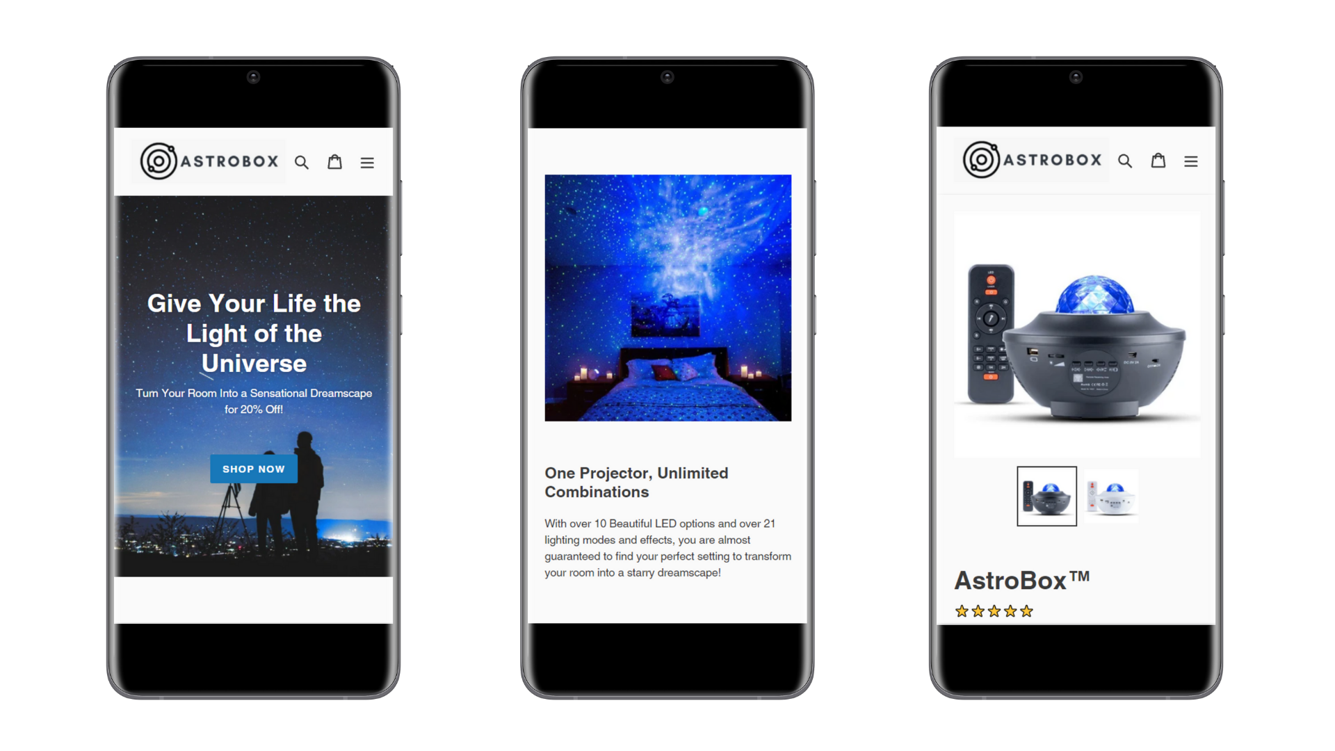
This client is a brand known as Astrobox. Their main product is a portable light projector which can display multiple combinations of space-themed projectors from a starry night to vibrant auroras to dreamlike nebulae. The owner of the brand hired me to design and setup a minimalistic and effective Shopify store for them as they were expanding from primarily selling their product via Instagram and Facebook Shops.
When they first hired me, the brand was essentially a one-product store, meaning that there wasn't a lot of content to work with in regards to building up a typical full-fledged homepage. I was only given the basic description they used in their Facebook Shop and a couple images of the product taken from both the client and from previous customers.
Despite the lack of content, I knew it was more than possible to turn what I have into something amazing for the client. Given that this is a one-product brand, I decided to go with a Landing Page layout for the homepage.
I designed the page to not only keep the visitor looking at the page with the beautiful and luminous effects displayed in the images but also warm them up for a potential sale by emphasizing various benefits and social proof as they make their way down the page.
At the bottom of the page, instead of a button that goes to the product page, I wanted there to be the product itself on the homepage so that the visitor would stay on the site, making them more likely to convert into a sale.
To solve this problem, I did some theme customization so that not only would the product page be embedded right into the homepage but also so that the dynamic checkout buttons would be displayed along with the product, increasing the conversion rate by making it easier for visitors to convert into a sale.
Since the brand heavily utilized their Instagram presence to drive traffic to the store, I developed a custom-made, automatically updating gallery showcasing their most recent Instagram posts, adding another layer of content into the homepage as well as additional social proof to further warm up potential customers.
One final update I did to the site was in regards to their FAQ page. Instead of a long and convoluted page of text I developed an accordion-style tabs menu. This not only makes it far easier for the visitor to easily find the answers to their questions without wasting time scrolling but I also designed it to be super-easy to add additional questions and answers by the client- no additional coding needed!
My client couldn't be happier. They now have a fast-loading premium store that is easy to maintain, fits extremely well with their brand image, and is built to convert visitors into customers. Thanks to my help, they were able to generate over six-figures in profit and boosted their conversion rate to over 5.3% nearly 5x the average conversion rate for Shopify stores!
